

With the move towards a predominantly mobile internet, the era has come for websites to move fully into the responsive CSS domain. Frustrated by the many, often over-complicated options, I recently discovered Skeleton CSS – and it has changed my web design life forever.
A responsive website is one that dynamically adjusts and “responds” given the device dimensions it is being viewed upon. For instance, a well designed responsive website will look decent on your desktop browser, and as you marginally decrease the size of the window, the website should still appear attractive, legible and intuitive on the smaller surface.
Skeleton CSS is so easy to learn and use
I am entering my 16th year of web design. I have come and gone through different phases of jadedness, and the last few years I have outsourced a lot of my CSS and programming work to freelancers.
I run many different projects, inside and outside of the web world, and I don’t have the time or patience to sit in front of a computer for months of learning new technologies.
Hesitantly, and almost desperately, I found Skeleton by chance looking up anything from “responsive CSS” and “responsive CMS” frameworks.
I nearly skipped past Skeleton on the list, but an inner voice suggested I check it out.
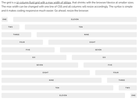
I read about its grid system, and personally observed how their example grid transformed upon decreasing my browser’s size (tip: for a good gauge what a mobile website looks like in Firefox, decrease your browser all the way from the right to the left as far as it will go).
Their tutorial breaks down managing their incredibly slim code into nine core components: Grid, Typography, Buttons, Forms, Lists, Code, Tables, Queries, Utilities.
I downloaded the zip from github, opened up the index.html and skeleton.css files in my copy of Dreamweaver, and started playing.
By the end of the afternoon I had created three new websites.
Taking web design to the next level
Skeleton’s advantage to me, beyond it’s incredibly fast learning curve, is it puts the power back into my hands. I’m once again excited about hands on web design.
Instead of touching up a PSD design and hand it straight to my developers, I can now experiment with the design in functional HTML and CSS. I can see how elements change on different devices, and adjust and tweak on the fly.
By the time I’ve handed the design files over to the developers, I’ve already built most of the site! Plus the all-important mobile version, that in the past has been a major undertaking unto itself.
It has raised the quality of my offerings and services while allowing me to drop my prices – yet potentially increase my margins.
Skeleton CSS powers mother.domains
I wouldn’t hype something up this much and not use it in the real world.
I was so impressed by Skeleton that I have built the majority of the first official mother.domains website on it.
Also check it out on www.tropicanatease.com, www.improvilicious.com.au, the new www.illustration.com.au, and several more sites I’ll share with you soon.
Check our Skeleton here – http://getskeleton.com/
Greetings from Carolina! I’m bored at work so I decided to browse your site on my iphone during lunch break. I enjoy the knowledge you provide here and can’t wait to take a look when I get home. I’m surprised at how quick your blog loaded on my mobile .. I’m not even using WIFI, just 3G .. Anyways, wonderful site!|
Hey thank you very much! Please say hello again sometime!
Hi just wanted to give you a quick heads up and let you know a few of the pictures aren’t loading correctly.
I’m not sure why but I think its a linking issue.
I’ve tried it in two different browsers and both show the same results.
Ah thanks for that – Which pages are you referring to?
Thank you for your kind words!